Asked by Gerson Hernandez on Apr 25, 2024

Verified
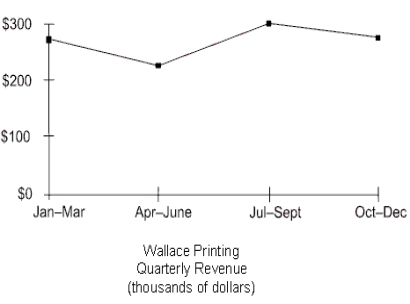
The table below displays the quarterly revenue of Wallace Printing for this year, arranged by quarter. The numbers are all in thousands of dollars. Use Figure 24-5a and Figure 24-5b to construct a bar graph and a line graph for the data. Label where necessary.
a.Bar graph
b.Line graph
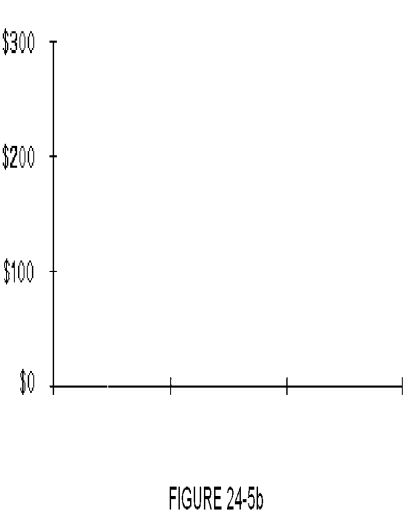
Quarterly Revenue
The total amount of income generated by a company during a three-month period, typically used to assess financial performance.
Bar Graph
A visual representation of data that uses bars of varying heights to show the values of different categories.
Line Graph
A type of chart used to display information as a series of data points connected by straight line segments.
- Produce and analyze bar charts for singular and comparative data examination.
- Develop and analyze line charts to assess trends over periods.

Verified Answer


Learning Objectives
- Produce and analyze bar charts for singular and comparative data examination.
- Develop and analyze line charts to assess trends over periods.
Related questions
Last Year, David Lum Opened a New Pharmacy ...
Which of the Following Varieties of Bar Graphs Show the ...
The Average Price for Different Brands of Toothpaste Could Be ...
The Table Below Displays the Quarterly Revenues of Wallace Printing ...
The Bar Graph Below Represents the Highest Education Level Achieved ...