Asked by Marwah Al Duais on Apr 23, 2024

Verified
The City of Windsor Department of Parks and Recreation is planning to build a recreation centre in one of the city's parks.They conducted a poll to find out which of five types of physical activities the local population would be interested in.The poll was based on telephone responses from 1013 randomly selected adults.The table shows the percentages of people who expressed interest in various activities. Activity Percent Running/Walking 56% Weight Training 48% Biking 33% Aerobics 25% Swimming 13%\begin{array} { l | c } { \text { Activity } } & \text { Percent } \\\hline \text { Running/Walking } & 56 \% \\\text { Weight Training } & 48 \% \\\text { Biking } & 33 \% \\\text { Aerobics } & 25 \% \\\text { Swimming } & 13 \%\end{array} Activity Running/Walking Weight Training Biking Aerobics Swimming Percent 56%48%33%25%13% Which of the following displays is/are appropriate to describe the data for these five activities? (More than one display may be appropriate.)
I 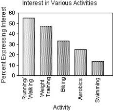
II 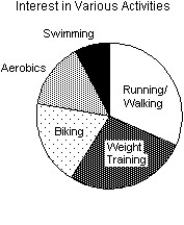
III 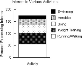
A) I
B) I,II
C) I,II,III
D) II
E) None of these displays are appropriate.
Recreation Centre
A facility provided by the community or a private entity, offering recreational and leisure activities and services.
Physical Activities
Any bodily movement produced by skeletal muscles that requires energy expenditure, including exercises and daily routine movements.
Telephone Responses
Answers or feedback collected over the phone, often used in surveys or customer service inquiries.
- Distinguish between appropriate and inappropriate graphical displays for given data.

Verified Answer
AN
Abdullah NaeemMay 02, 2024
Final Answer :
A
Explanation :
The most appropriate display to represent this data is a stacked bar graph, where each bar represents the total percentage of people interested in each activity, and the different colors within each bar represent the percentage of people interested in each age group. Option I displays this information accurately and in a visually clear manner. Option II displays the data in a stacked bar graph, as well as a pie chart, which is unnecessary and can make it more challenging to compare the different activities. Option III shows a scatter plot, which is not appropriate for this type of data. Therefore, the best choice is A) I.

Learning Objectives
- Distinguish between appropriate and inappropriate graphical displays for given data.