Asked by Luisa Zapote on Sep 22, 2024

Verified
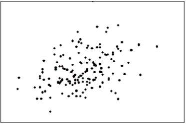
The first scatter diagram below shows a stronger linear relationship than the second scatter diagram.(Assume the scales on both scatter diagrams are the same.) 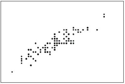
Scatter Diagram
A graphical representation of two variable data points that helps to determine the relationship between them.
Linear Relationship
A type of relation between two variables where the change in one variable is directly proportional to the change in another variable.
- Identify and make sense of scatter diagrams, considering both the direction and strength of a relationship.
- Describe features that indicate a strong or weak linear relationship in scatter diagrams.

Verified Answer
AA
Alina Ahmad1 day ago
Final Answer :
True
Explanation :
The first scatter diagram shows a stronger linear relationship because the points cluster more closely around a straight line, indicating a higher correlation between the two variables being plotted. The second scatter diagram shows more scattered points with less of a clear linear trend.

Learning Objectives
- Identify and make sense of scatter diagrams, considering both the direction and strength of a relationship.
- Describe features that indicate a strong or weak linear relationship in scatter diagrams.
Related questions
If We Draw a Straight Line Through the Points in ...
The Scatter Diagram Below Depicts Data with a Negative Linear ...
The Two Most Important Characteristics to Examine in a Scatter ...
The Two Most Important Characteristics Revealed by the Scatter Diagram ...
A Professor Examines the Relationship Between Minutes Studying and Exam ...